
In the realm of data management and analysis, visualization plays a pivotal role in transforming raw data into actionable insights. At Fieldata, we understand that effective data visualization not only enhances comprehension but also drives informed decision-making. Our platform is designed with advanced visualization capabilities to ensure that users can interact with and interpret their data with clarity and precision. Below, we delve into the various aspects of visualization at Fieldata, detailing our fe
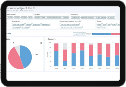
Our dynamic dashboards are the heart of Fieldata's visualization capabilities. They offer a comprehensive overview of key metrics and performance indicators through interactive and customizable displays. Key features include:
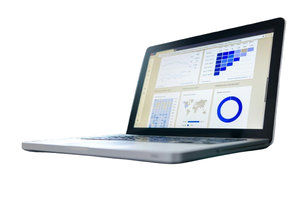
 Customizable Widgets
Users can tailor their dashboards with a variety of widgets, including charts, graphs, maps, and tables. This flexibility allows for the creation of dashboards that meet specific analytical needs and preferences.
 Real-Time Data Updates
Dashboards update in real time, providing users with the most current data available. This feature is crucial for monitoring ongoing projects and making timely decisions based on the latest information.
Interactive Elements
Users can interact with data visualizations through drill-downs, filters, and clickable elements. This interactivity enables a deeper exploration of data and facilitates the discovery of insights that may not be apparent from static views.
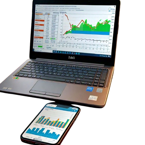
Fieldata supports a wide range of charting options to visualize data effectively. These include:
Bar and Column Charts
Ideal for comparing data across different categories or time periods, bar and column charts provide a clear visual representation of relative values.
Line Charts
Useful for showing trends over time, line charts allow users to track changes and patterns in data with a clear and continuous line.
Pie Charts
Pie charts are effective for illustrating the proportions of different components within a whole, making them useful for understanding the distribution of categorical data.
Scatter Plots
Scatter plots help users identify relationships and correlations between two variables, offering insights into data patterns and trends.
Heat Maps
Heat maps provide a visual representation of data density or intensity, making it easy to identify areas of high or low activity within a dataset.
Fieldata's geospatial visualization tools enable users to map and analyze data with a geographical context. Key features include:
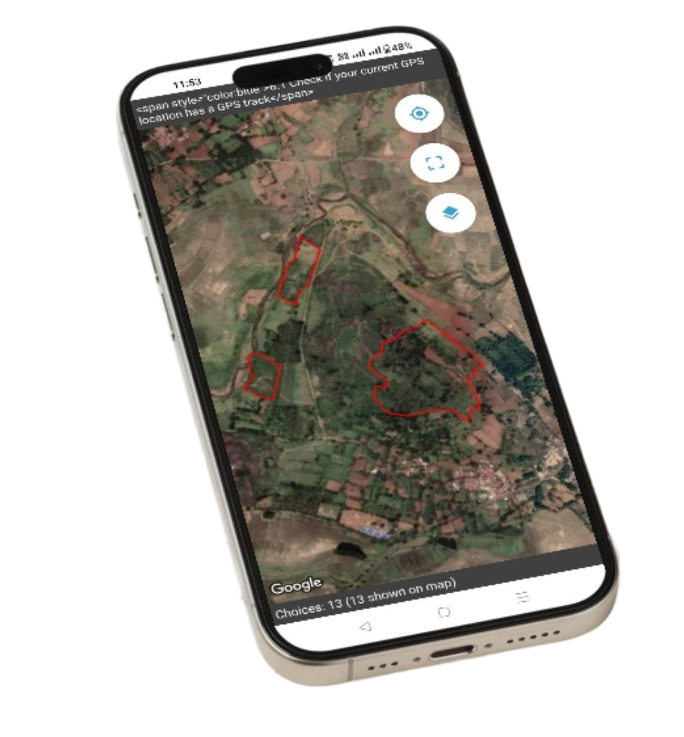 GPS Mapping
Visualize data points on interactive maps using GPS coordinates, providing a geographic perspective on data distribution and patterns.
Polygon Mapping
Draw and analyze data within defined geographic boundaries using polygon mapping. This feature is useful for tasks such as surveying specific areas or regions.
Heat Maps on Maps
Overlay heat maps on geographic maps to visualize data density and identify spatial patterns, such as hotspots or areas of interest.
Fieldata provides tools for generating custom reports and analytics that leverage visualization to convey insights. Features include:
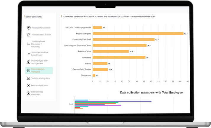 Report Builder
Create detailed reports using a combination of charts, graphs, and tables. The report builder allows for customization of report layouts and the inclusion of various visualization elements to present data effectively.
Interactive Reports
Generate interactive reports that users can explore and interact with, offering a more engaging way to analyze data compared to static reports.
Export Options
Export reports and visualizations in various formats, including PDF, Excel, and image files, to facilitate sharing and presentation.
Our platform supports advanced data exploration features that allow users to dig deeper into their data:
Drill-Down Capabilities
Users can drill down into data visualizations to view more detailed information. For example, clicking on a segment of a pie chart might reveal the underlying data or additional metrics related to that segment.
Filtering and Segmentation
Apply filters and segmentation to data visualizations to focus on specific subsets of data. This feature helps users isolate and analyze particular aspects of their data for more granular insights.
 Enhanced Data Comprehension
Visualization transforms complex data into intuitive and understandable formats. By presenting data in charts, graphs, and maps, users can quickly grasp trends, patterns, and key metrics without needing to sift through raw data.
Improved Decision-Making
With real-time and interactive visualizations, users can make informed decisions based on up-to-date and comprehensive data insights. Visualization tools help users identify opportunities, address issues, and make strategic choices with greater confidence.
Greater Engagement
Interactive visualizations engage users by allowing them to explore and interact with data. This engagement fosters a deeper understanding of the data and encourages more active analysis.
Efficient Data Communication
Visualizations provide a clear and effective way to communicate data insights to stakeholders, team members, and decision-makers. Well-designed visualizations make it easier to convey complex information and drive discussions.
Data-Driven Insights
By leveraging advanced visualization tools, users can uncover hidden insights and trends within their data. This capability enables organizations to identify patterns, correlations, and anomalies that might not be immediately apparent from raw data.
At Fieldata, we recognize that visualization is a critical component of effective data analysis and decision-making. Our platform is designed to provide users with a robust suite of visualization tools that enhance data comprehension, support informed decision-making, and foster engagement. From dynamic dashboards and comprehensive charting options to geospatial mapping and custom reports, Fieldata offers a comprehensive range of features to meet your data visualization needs. By leveraging our advanced visualization capabilities, you can unlock the full potential of your data and drive meaningful results for your organization.
By using this website you agree with the use of cookies, detailed in our privacy policy